After looking at a range of different magazines adverts, I have decided to design a typography based advert. Whilst looking at other examples, I have noticed that most companies either use photography or typography. As I felt that a photography styled advert wasn't were I wanted to take my own ideas. I have decided to research more into typefaces. As I feel that this could be a option for my own advert itself.
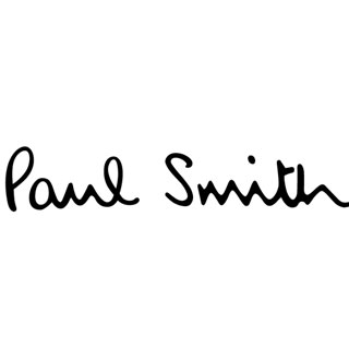
I have decided to look into three other aftershave companies to look at including Paul Smith, Ralph Lauren and Lacoste, in particular the logo themselves. The main focus point I have noticed within these logos is the white space that surrounds them. This draws to your eye, especially the Paul Smith logo. I plan to experiment with this white space and see how it works on my own typography. Lacoste have opted to use a simple sans serif typeface, big and bold I feel is what Lacoste are trying to portray. The crocodile is also a focus point, the red of the mouth gives the logo that little splash of colour which pleases the eye. I personally like the simplicity of the crocodile, this would work well if the logo was to be sized big and small. This is a factor to consider. However Ralph Lauren have opted to use a serif font which in my opinion makes the brand seem more expensive. This is called semiotics. Again we notice that Ralph Lauren also have a logo, which in case is a horse with a man playing polo. This aims at the sport interested public, which also was the same as Brut. This relates beautifully. Reverting back to the typography, I feel the Paul Smith logo is less successful typography logo out of the three, as I don't feel the font is bold or clear enough. I looked at this logo with colour situated in the background, the logo was completely lost. This was a shame as I do like the styling of this serif, it has a lovely hand written feel. Some of my experiments show this style, however I hadn't had much luck, I found a bold font to be more successful.


No comments:
Post a Comment